Introduction
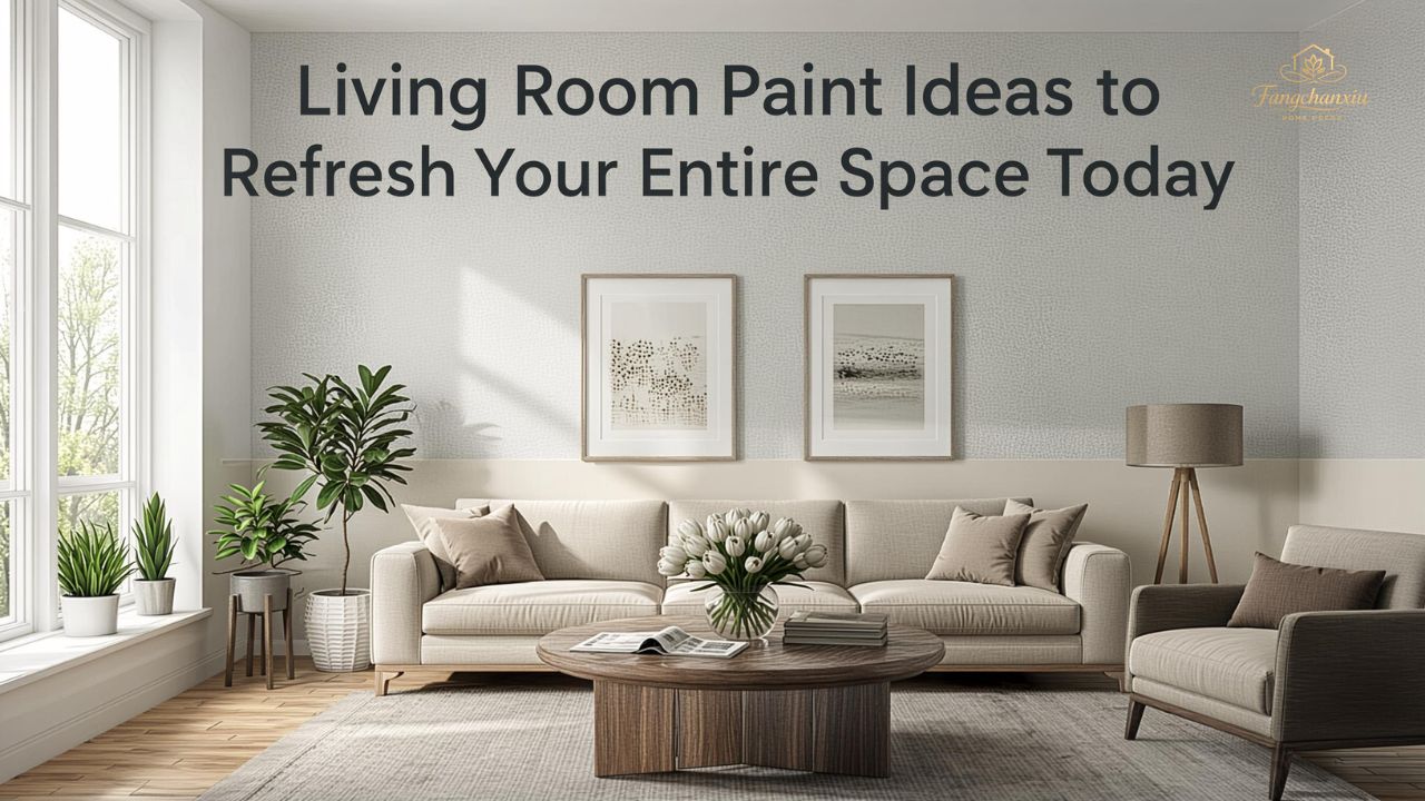
A fresh coat of paint can change the entire mood of a home, and that is exactly why living room paint ideas matter so much. The living room is where people gather, unwind, host guests, watch movies, and spend slow evenings, so the color on the walls shapes more of daily life than many people realize.
The right shade can make a cramped room feel open, a dark room feel brighter, and a plain room feel thoughtful and finished. It can also tie together your sofa, rug, curtains, artwork, and lighting without forcing you into a full remodel.
That is why choosing from so many living room paint ideas can feel exciting and overwhelming at the same time. Some colors look beautiful online but fall flat in real life. Others seem simple at first, then end up being the most timeless choice in the house.
This guide breaks the process down in a practical way. You will find color directions that suit different styles, room sizes, light levels, and comfort goals, along with tips that help you avoid common mistakes before you open a paint can.

How to Choose the Right Paint Color for Your Living Room
Before looking at specific shades, it helps to understand what makes one color work beautifully in a room while another misses the mark. Good paint choices are rarely random. They usually come from reading the room carefully.
Three things matter most: natural light, fixed elements, and the feeling you want to create.
Natural light changes everything. A soft beige may look creamy and warm in a sunlit room but slightly dull in a north-facing one. A cool gray might feel crisp in a bright space and flat in a dim room. Always test samples during morning, afternoon, and evening light.
Fixed elements are the features you are not planning to replace soon. These may include:
- flooring
- fireplace stone or brick
- large sofas
- built-in shelves
- wood trim
- curtains
- large rugs
The feeling of the room matters just as much as the color itself. Ask whether you want the room to feel calm, dramatic, airy, elegant, relaxed, cozy, or modern. That answer narrows your direction faster than any color fan deck.
After you answer those questions, many living room paint ideas start becoming easier to judge. Instead of picking the prettiest color in isolation, you start choosing a color that fits your real home.
![Image: Painted sample swatches on a living room wall in different light]
Living Room Paint Ideas for a Bright and Airy Feel
If your goal is openness, softness, and a sense of calm, lighter colors are usually the best place to start. They reflect more light, visually pull walls outward, and create a clean foundation for many decorating styles.
Soft White
Soft white is not the same as stark white. It has a little warmth or creaminess, which keeps the room from feeling sterile. It works especially well in homes with layered textures such as linen curtains, wood tables, boucle chairs, and woven baskets.
Soft white is a strong option when you want:
- a fresh but comfortable feel
- a flexible backdrop for seasonal decor
- brighter walls in a small room
- a gallery-like setting for artwork
Warm Beige
Warm beige has made a strong return because it feels grounded and easy to live with. It brings softness without looking too yellow when chosen carefully. In a living room, beige can make the whole space feel settled and welcoming.
This color works especially well with:
- oak or walnut furniture
- cream upholstery
- brass accents
- natural stone
- earthy textiles
Pale Greige
Greige sits between gray and beige, giving you the calm of gray with more warmth. It is one of the safest and most versatile choices for people who want a subtle upgrade without going too trendy.
Among popular living room paint ideas, pale greige stands out because it blends easily with modern, transitional, and farmhouse interiors. It feels polished, but it rarely steals attention from the rest of the room.
Warm Color Families That Make a Living Room Feel Cozy
Some living rooms need more than brightness. They need warmth, softness, and a little emotional comfort. That is where warm paint colors shine. These shades help large rooms feel less empty and make everyday living feel more intimate.
Creamy Off-White
Creamy off-white adds more comfort than plain white. It works beautifully in family living rooms where you want brightness but not a cold finish. It also pairs well with warm woods, tan leather, and antique-inspired decor.
Muted Taupe
Taupe is a balanced neutral with depth. It can read slightly brown, slightly gray, or even slightly rosy depending on the undertone. In a living room, it creates a cocooning effect without becoming heavy.
Taupe is a smart choice if you want the walls to feel richer than beige but still timeless.
Dusty Terracotta
Terracotta is earthy, relaxed, and full of personality. A muted version can transform a living room into a warm, stylish retreat. It feels especially beautiful in homes with plants, textured fabrics, handmade pottery, and natural wood.
This is one of those living room paint ideas that feels creative without becoming hard to decorate around. When toned down properly, terracotta adds character while staying livable.
![Image: Cozy living room with warm taupe walls, wood accents, and soft lighting]
Cool Color Families for a Calm, Modern Mood
Cooler colors are often chosen for their clean, quiet effect. They can help a living room feel neat, thoughtful, and slightly more architectural. These shades are especially useful when your room gets plenty of warm sunlight and needs balance.
Misty Gray
Misty gray offers a soft modern look. It works best when the undertone is gentle and not overly blue. In a living room with black accents, white trim, and simple furniture, it feels fresh and composed.
Sage Green
Sage green has become a favorite because it feels natural, restful, and easy on the eyes. It acts almost like a neutral while still bringing in color. It works beautifully with wood furniture, off-white upholstery, matte black fixtures, and indoor plants.
Sage is one of the most flexible living room paint ideas for people who want something more interesting than beige but less risky than a deep color.
Dusty Blue
Dusty blue adds softness and elegance. It can lean coastal, classic, or modern depending on the furniture around it. In rooms with good daylight, it feels open and serene. In evening light, it can feel slightly moody in a very appealing way.
Bold Living Room Paint Ideas That Still Feel Sophisticated
Bold colors can be stunning in a living room when they are used with intention. The trick is not simply choosing a dark or vivid color. The trick is choosing one that matches the room’s size, light, and furnishings.
Deep Green
Deep green feels rich, grounded, and upscale. It pairs well with warm wood, brass, cream textiles, and vintage art. In the right setting, it creates a memorable room without feeling loud.
Try it if your living room has:
- tall ceilings
- strong natural light
- built-in bookcases
- classic furniture
- a fireplace wall worth highlighting
Charcoal Blue
Charcoal blue offers drama with more softness than black. It works beautifully in contemporary homes and can make a room feel tailored and calm at the same time. If your furniture is mostly light, this shade creates striking contrast.
Rich Clay or Cinnamon
These earthy tones bring warmth and confidence. They feel personal, stylish, and collected. They are especially effective in homes that mix modern shapes with handmade or rustic elements.
Not all bold living room paint ideas need to cover every wall. Sometimes a bold color works best on a single wall, in a niche, or around a fireplace to create focus without overwhelming the space.
The Best Paint Directions for Small Living Rooms
Small living rooms often make people think they must use plain white, but that is not always true. Size matters, but so do light, furniture scale, and visual clutter. A compact room can look bigger with the right color, yet it can also look more stylish with a slightly deeper tone than expected.
Go Light When the Room Feels Dark
If the room lacks sunlight, lighter shades usually help most. Think soft white, pale beige, light greige, or a gentle warm gray. These shades bounce light and keep the walls from closing in visually.
Use Mid-Tones for Depth
A mid-tone like sage, mushroom, or taupe can give a small room more depth than stark white. This works particularly well when trim, ceiling, and walls are close in tone, which creates fewer harsh visual breaks.
Keep the Palette Cohesive
Small rooms benefit from color continuity. Try to connect the wall color with major pieces in the room, such as the rug, sofa, drapes, or art. This prevents the space from feeling chopped up.
When reviewing living room paint ideas for small spaces, remember that contrast can either help or hurt. A little contrast adds interest. Too much makes the room feel busy.
Paint Ideas Based on Design Style
Sometimes the easiest way to choose a color is by matching it to the style you already love.
Modern Living Rooms
Modern spaces usually look best with cleaner, restrained colors. Good choices include:
- soft white
- pale greige
- muted gray
- charcoal blue
- olive green
These shades support simple lines and uncluttered layouts without feeling flat.
Traditional Living Rooms
Traditional rooms often benefit from richer, warmer, more layered tones. Consider:
- taupe
- warm cream
- dusty blue
- muted green
- mushroom tones
These colors work well with classic molding, antique furniture, patterned drapes, and framed art.
Farmhouse or Rustic Spaces
Farmhouse-style living rooms often suit warm neutrals and earthy shades. Try creamy white, soft beige, sage, or clay-inspired tones. These feel relaxed and natural, especially with wood beams and textured fabrics.
Contemporary Eclectic Rooms
If your room mixes styles, art, and collected decor, you have more freedom. That is where more expressive living room paint ideas can work beautifully, including terracotta, moody green, dusty rose-beige, or deep blue-gray.
![Image: Infographic showing warm, cool, neutral, and bold living room paint palettes]
Accent Walls, Trim, and Ceiling Ideas
Wall color is only part of the picture. Accent walls, trim, and ceilings can shape the room just as much when handled thoughtfully.
When an Accent Wall Works
An accent wall works best when the room already has a natural focal point, such as:
- a fireplace
- TV wall
- built-in shelving
- architectural paneling
- a windowed feature wall
Without a natural focal point, an accent wall can feel random.
Painting the Trim
Painting trim the same color as the walls creates a soft, seamless look. This is especially useful in modern spaces or small rooms. White trim, on the other hand, gives a cleaner contrast and feels more classic.
Do Not Ignore the Ceiling
A ceiling painted one shade lighter than the walls can feel subtle and elegant. In some rooms, painting the ceiling the same color as the walls creates a wrapped, cozy effect that feels intentional and designer-led.
Common Paint Mistakes to Avoid
Even the best colors can disappoint if they are chosen or applied carelessly. Here are the mistakes that cause the most regret.
Choosing Paint From a Tiny Swatch
A color chip is too small to tell the full story. Always sample larger patches on multiple walls before deciding.
Ignoring Undertones
Two beiges can look similar until one turns yellow and the other turns pink once it is on the wall. Undertones matter more than many people expect.
Forgetting About Lighting
Paint changes throughout the day. A color you love at noon may look completely different after sunset with lamps on.
Picking the Color Before the Rug or Sofa
It is usually easier to match paint to big furnishings than the other way around. If you are still buying major pieces, wait until those are chosen first.
A thoughtful approach keeps living room paint ideas from turning into expensive do-overs.
How to Test Paint Before Committing
Testing saves time, money, and frustration. It also gives you confidence.
Sample More Than One Shade
Pick at least three close options. Sometimes your favorite shade is not the one you expected.
Paint Large Sections
Use sizable sample patches, not tiny brush marks. You need enough surface area to see depth, undertone, and light reaction.
Watch the Color for Two Days
Check it in:
- morning daylight
- afternoon sun
- evening lamp light
- cloudy weather if possible
Compare It With the Room’s Materials
Set the sample beside your sofa, curtains, flooring, and wood tones. This reveals whether the shade truly belongs in the room.
FAQ
What is the best color for a living room that gets little natural light?
Warm off-whites, creamy beige, and pale greige tend to work best. These shades reflect available light and make the room feel softer and brighter without looking harsh.
Are gray living rooms still in style?
Yes, but the sharp cool grays that once dominated are less popular than softer, warmer grays. Today, people often prefer shades with a touch of beige, green, or taupe for a more lived-in feel.
Should the living room match the rest of the house?
It does not need to match exactly, but it should feel connected. Colors across the home should flow naturally rather than clash from one room to the next.
Is white a good choice for a family living room?
Yes, as long as you choose a soft white instead of a stark one. A warmer white usually feels more comfortable and forgiving in everyday family spaces.
What paint finish works best in a living room?
Eggshell and satin are common choices. They offer a gentle finish with enough durability for daily life while still looking soft on the walls.
Can I use dark paint in a small living room?
Yes, especially if the room has character, decent lighting, and a cohesive design. Dark paint can make a small room feel intimate and stylish rather than cramped.
What colors make a living room feel more expensive?
Soft greige, muted taupe, deep green, dusty blue, and creamy whites often create a refined look. The secret is choosing balanced undertones and pairing the color with layered textures.
How many paint colors should I use in one living room?
One main wall color is often enough, with one or two supporting tones through trim, ceiling, or accents. Too many paint colors can make the room feel unsettled.
Conclusion
The best paint color is not always the boldest or the trendiest one. It is the shade that makes your living room feel right when you walk into it in the morning, when guests come over, and when the lamps turn on at night.
Some homes need softness. Some need depth. Some need warmth, brightness, or a little more personality. The good news is that great living room paint ideas are not about copying someone else’s space. They are about understanding your room, your light, and the atmosphere you want to live in every day.
When you slow down, test carefully, and trust what works in your actual home, the result feels less like a paint job and more like a real transformation.